Analysis of a Flash Flood

Flash floods seem to be increasing in many areas. This post will show how to download local USGS flow and precipitation data and generate a 3-panel chart of flow, gage height and precipitation.

There was a tragic flash flood incident in Berks County Pennsylvania on July 11-12, 2019 that caused the death of 3 people, including a pregnant woman and her young son. This newspaper article (link) provides some details on this tragic event.

The timing of this flash flooding was interesting to me because the woman and her son were trapped in their car by a small tributary to the Schuylkill River at 4:30 PM on Thursday, July 11 and flooding in Philadelphia started about 1:30 Am on Friday, July 12th. The tragic drowning occurred on the Manatawny Creek , about 35 miles Northwest of Philadelphia.

I plan to write a series of posts to document the rainfall patterns and timing of the rainfall and subsequent flooding.

This initial post will present show the flow hydrograph, cumulative precipitation and gage height at for the USGS’s Schuylkill river gaging station #01474500 at Fairmount Dam.

Follow-up posts will review the upstream USGS data as well as national weather service rainfall data.

Here is the 3 panel chart showing the hydrograph, precipitation data and gage height data for the period July 9 – 16, 2019.

Here’s the R script for analyzing and plotting csv file downloaded from USGS site.

#################################################################################################################

## get source data file link
link <- "C:\\Users\\Kelly O'Day\\Desktop\\Schuylkill_flood\\CSV_files\\Schuylkil_Fairmont_Dam_7_days_july_2019.csv"
#(link <- choose.files())
df <- read.csv(link, as.is=T)
df$dt <- mdy_hm(df$datetime)
dt_min <- df$dt[1]
dt_max <- df$dt[nrow(df)]

peak_flow <- max(df$cfs, na.rm=T)
peak_flow_comma <- format(peak_flow, big.mark=',')
peak_dt <- df$dt[which(df$cfs == peak_flow)]
from_to <- paste(month(dt_min),"/",day(dt_min), " to ", month(dt_max),"/",day(dt_max),"/",year(dt_max),sep="")

# Create 3 panel charts for flow, precipitation and gage height
par(mfrow = c(3,1),ps=10, pty="m",xaxs="r",yaxs="r")
par(las=1,oma=c(2.5,2,3,1), mar=c(2,5,3,0))
par(mgp=c(4,1,0)) # Number of margin lines for title, axis labels and axis line

## Flow chart
plot_title <- paste("Flow - cfs")
plot(df$dt, df$cfs, type="l", xlab="", ylab = "Flow -cfs",xlim=c(dt_min,dt_max), yaxt="n",
main =plot_title)
axis(side=2, at=axTicks(2),
labels=formatC(axTicks(2), format="d", big.mark=','))

points(peak_dt, peak_flow, pch=16, col="red")
spacer <- 4*60*60
note <- paste("Peak @ ", peak_flow_comma, " cfs \n", peak_dt)
abline(h = seq(10000,50000,10000), col = "grey")
abline(v= seq(dt_min,dt_max,by="day"), col="grey")
text(peak_dt+ spacer,peak_flow * 0.975, note, adj=0, cex=1)
################################################
# Sheet title annotation
mtext("Flood Conditions @ Fairmount Dam (July 9-16, 2019)", side = 3, line = 3, adj = 0.5, cex = 1.2)

##### precipitation data analyis n& Chart
df$cum_precip <- cumsum(df$inches)
tot_precip <- df$cum_precip[nrow(df)]
precip_st_row <- length(subset(df$cum_precip, df$cum_precip == 0))
precip_st_dt <- df$dt[precip_st_row]

precip_note <- paste0("Total Precip - ",tot_precip, " inches")
precip_subset <- subset(df, df$cum_precip == tot_precip)
precip_end_dt <- mdy_hm(precip_subset[1,1])

#precip_end_dt_t <- mdy_hm(precip_end_dt)
plot(df$dt, df$cum_precip, type="l", xlab="", ylab = "Precipitation -inches",xlim=c(dt_min,dt_max),
main = "Cummulative Precipitation - Inches")
points(precip_st_dt,0, pch=12, col = "blue")
points(precip_end_dt,tot_precip, pch=12, col="blue")
abline(v= seq(dt_min,dt_max,by="day"), col="grey")
text(dt_min,tot_precip, precip_note, adj=0)
precip_st_note <- paste0(" Precipitation Starts @ ",precip_st_dt)
dur <- precip_end_dt - precip_st_dt

precip_end_note <- paste0(" Precipitation ends @ ",precip_end_dt,"\n ",dur, " hours")
text(precip_end_dt,tot_precip * 0.9, precip_end_note, adj=0, cex = 1)
text(precip_st_dt, 0, precip_st_note, adj=0, cex = 1)

#### gage height chart
gage_act_df <- subset(df, df$gage >= 10)
gage_act_dt <- gage_act_df$dt[1]
gage_act_note <- paste0("Gage Action Level @ \n",gage_act_dt)
plot(df$dt, df$gage, type="l", xlab="", ylab = "Gage Height - Ft",xlim=c(dt_min,dt_max),
main ="Gage height - ft")
abline(h = 10, col="brown")
abline(h=11, col = "red", lwd =1)
abline(v= seq(dt_min,dt_max,by="day"), col="grey")
points(gage_act_dt,gage_act_df[1,3],pch=11, col = "black")
text(gage_act_dt - 1*4*3600, 10,gage_act_note, adj=1)
min_gage <- min(df$gage, na.rm=T)
max_gage <- max(df$gage, na.rm=T)
delta_gage <- max_gage - min_gage
gage_note <- paste("Max Gage @ ", max_gage, " ft\nGage Increase ", delta_gage, " ft")
text(dt_min, max_gage*0.97, gage_note, adj=0, cex=1)

flood_act_note <- "Flood Action stage @ 10-ft"
flood_stage_note <-"Flood stage @ 11-ft"
text(dt_max-60*60,10.25, flood_act_note, adj = 1, cex=0.95)
text(dt_max - 1*1*60*60,11.25, flood_stage_note, adj = 1, cex=0.95)

##########################################
# Sheet annotation - Footer Notes
mtext("K O'Day - 7/19/19", side = 1, line = 3, adj = 0, cex = 0.9)
mtext("Data Source: USGS: https://waterdata.usgs.gov/nwis/inventory/?site_no=01474500", side=1, line = 2, adj=0, cex = 0.9)

# png(file="C:\\Users\\Kelly O'Day\\Desktop\\Schuylkill_flood\\myplot.png", bg="white")

dev.off()

Posted in R | Tagged | Leave a comment

Annual Mean Temperature Trends – 12 Airports

12_airport_trend

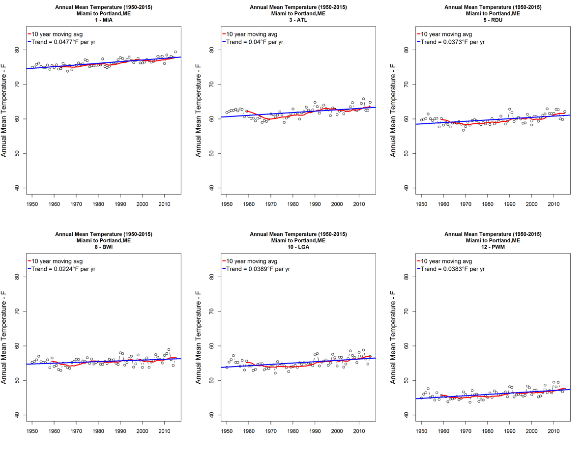
This animated gif  shows changes in annual mean temperature at 12 East Coast USA airports that had continuous daily data for the 1950 – 2015 period. The data was retrieved from Weather Underground using the R weatherData package .

11 of the 12 airports (all but JAX) show statistically significant increases in annual mean temperatures.


Posted in Climate Science, R, Uncategorized | Tagged | 1 Comment

RClimate Script to Assess Local Hot Day Trends

There is ample evidence of global climate change, these are just a few examples  (here, here, here).

While global indicators are important to focus attention on the problem and solutions, local data is important to help us understand the situation in our own areas.  There are a number of R packages that let users download and analyze weather data to investigate the climate change situation in local geographic areas.

I find the weatherData package an excellent tool for local climate change investigations. As an example, I downloaded daily weather data for my local airport  for the period 1950 – 2015, ran a simple r-script to count and save the number  of 90+ days each summer period to a csv file. This hot day trend chart is an  example  of what R users can do to visualize the changing climate.hot_day_trend_ KPHL

This chart shows that the number of 90+ days in Philadelphia has increased in the past 66 years. Prior to 1983 (midpoint of period), only 5 out of 30 years have 30 or more days of 90+ max temperatures. Since 1984,  13 of 36 years had 30 or more days of 90+ max temperatures.  2016 has had 38 days through August 28, making 16 of 37 years with 30 or more 90+ days.

My R script is reproduced below. My  R base graphics script could be easily reproduced in ggplot2.

  library(weatherData)
  library(stats)
  airport <- "KPHL"
## user can specify moving average period 
  ma_period <- 10
  ma_legend <- paste(ma_period," year moving avg")  
  
  setwd("F:\\enter woring directory here ")
 
## Read data from prev downloaded weather data file
  input_file <-  "F:\\enter input file name.csv"
  df <- read.csv(input_file, as.is=T)
  start_yr <- df[1,1]
  end_yr <- df[nrow(df),1]
  num_yrs <- end_yr -start_yr +1
  my_date <- format(Sys.Date(),"%m/%d/%Y")

## Use plot function to enable saving png as well as console display
 plot_func_1 <- function() {
   par(las=1); par(mar=c(1,4,5,1)); par(oma = c(3,2,2,1)); par(ps=11)
   title_1 <- paste("KPHL\nNumber days in year with Max temperaure >= ",90,
            "\n in hot weather months of May 1 - August 31\n",  start_yr, " through ", end_yr)
  plot(df$year, df$hot_day_count, type="n", lwd=3,
     main=title_1,  cex.main=0.8,   xlab="", ylab = "Number of days",
     ylim <- c(0,60),xlim=c(start_yr, end_yr) ) 
  grid(col = "lightgrey", lty=1) 
  points(df$year, df$hot_day_count, type="h", col="red", lwd=2) 
 
  legend("topleft", c(ma_legend, "No. days max temp >= 90", "Trend Line"), col = c("blue", "red","black"),
         text.col = "black", lty = c(1),pt.cex=c(0),  x.intersp = 0.25, y.intersp = 0.7,
         merge = T, bg = "transparent", bty="n", box.col = "black", cex = 0.7,seg.len=1, lwd=3)
  
## calculate and add 10 year moving average to plot
  ma <- stats::filter(df$hot_day_count, rep(1/ma_period,ma_period),sides=1 )
  my_seq <- seq(start_yr, end_yr)
  ma_df <- data.frame(my_seq, ma)
  names(ma) <- c("yr","ma")
  points(ma_df$my_seq, ma_df$ma, type="l", col="blue",lw=3)  
  abline(lm(hot_day_count ~ year, data = df),col="black")
  mtext("Kelly O'Day - http://RClimate.wordpress.com", side = 1, line = 1, cex=0.7, outer = T, adj = 0)
  mtext(my_date, side = 1, line =1, cex = 0.7, outer = T, adj = 1)
         }  
  out_file <-  paste("hot_day_trend_",airport,".png")  # location for png olot file
  png(file=out_file,width=1290,height=1000, res=200)  
  plot_func_1()  # send plot to png device
  dev.off()  # turn off png device
  plot_func_1()  # plot to console
Posted in Climate Science, R | Tagged | 1 Comment

RClimate Script to Plot 90+ days in summer

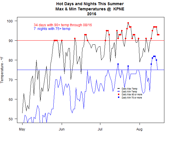
The weatherData package, link , makes it very easy to retrieve detailed weather data from hundreds of stations across the US. I developed this script to retrieve and plot daily maximum and minimum temperatures and highlight days with 90+ max temps and 75+ minimum temps. Here’s the results of my script:

KPNE_Summer_hot_days

The user can specify the desired weather station and can change the year to examine earlier years or the current year.

Here is the R script:

## Hot Days and nights this summer
## use weatherData package to retrieve Max & Min temperature data for summer months
## User can specify airport code, query will use this code to retrieve current yrs data 
library(weatherData)
  hot_days <- numeric()
  hot_nights <- numeric()
### Enter airport Code and year ##############  
  airport <- "KPNE"
  my_yr <- 2016
##############################################  
  my_start <- paste(my_yr,"-05-01",sep="")
  ## calc current date for data query
    end_date <- format(Sys.Date() -1, "-%m-%d")
    my_end <- paste(my_yr,end_date,sep="")
#### Retrieve data from Weather Underground   
  df <-  getWeatherForDate(airport,start_date=my_start,end_date= my_end,opt_detailed=F, opt_all_columns=F)
  hot_df <- subset(df, df$Max_TemperatureF>89)
  hot_days <- nrow(hot_df)
  hot_nights_df <- subset(df, df$Min_TemperatureF>75)
  hot_nights <- nrow(hot_nights_df)
  hot_day_note <- paste(hot_days, " days with 90+ temp through ",format(Sys.Date()-1,"%m/%d"), sep="")
  hot_nights_note <- paste(hot_nights, " nights with 75+ temp")

  y_lab <- expression(paste("Temperature - ", degree, "F"),sep="")
  title <- paste("Hot Days and Nights This Summer \nMax & Min Temperatures @ ",airport, "\n ",my_yr)

  ## Use plot function to allow both png file and console output of plot
 plot_func <- function() {    
  par(las=1)
  plot(df$Date, df$Max_TemperatureF,type="l", ylim =c(50,100),main=title,
       xlab="", ylab=y_lab) 
  abline(h=90, col="red")
  abline(h = 75, col = "blue")
  points(hot_df$Date, hot_df$Max_TemperatureF, type="p",pch=19, col = "red")
  text (df$Date[10], 98, hot_day_note, col = "red", adj=0)
  text (df$Date[10], 96, hot_nights_note, col = "blue", adj=0)
  points(df$Date,  df$Min_TemperatureF, col="blue", type="l")
  points(hot_nights_df$Date, hot_nights_df$Min_TemperatureF, type="p", pch=19, col="blue")
 
  legend(df$Date[75],67, c("Daily Max Temp", "Daily Min Temp", "Daily Max 90 or more", "Daily Min 75 or more" ), 
         col = c("black", "blue","red", "blue"),
         text.col = "black", lty = c(1,1,0,0),lwd = c(2.5,2.5,0,0),seg.len=1, pch=c(0,0,19,19),pt.cex=c(0,0,1,1),
         merge = T, bg = "", bty="n", box.col = "white", cex = .7, ncol=1)
  }

 # Output to png file and plot to console
  png(file= "F:\\RClimate.us\\RClimate_Posts\\KPNE_Summer_hot_days.png", width=600, height=500)
  plot_func() 
  dev.off()
  plot_func() 
  
Posted in R, Uncategorized | Tagged | Leave a comment

El Nino – La Nina & Hurricanes

Posted in Climate Science | Leave a comment

Access and Analyze 170 Monthly Climate Time Series Using Simple R Scripts

Open Mind, a climate trend data analysis blog, has a great Climate Data Service that provides  updated consolidated csv file with 170 monthly climate time series. This is a great resource for those interested in studying climate change. Quick, reliable access to 170 up-to-date  climate time series will save interested analysts hundreds – thousands of data wrangling hours of work.

This post presents a simple R script to show how a user can select one of the 170 data series and generate a time series plot like this:

CO2_Mauna_Load

Plot scaling and labeling is automatically generated by this R script.

## Open Mind Blog offers a Climate Data Service : https://tamino.wordpress.com/2016/04/10/climate-data-service-2/
## Script to read OMDS - Produce simple trend chart
## User is prompted to enter series_id
## Script reads OMDS file01 and plot time series for requested series_id

# Establish diretory path and file names
   my_dir <-  "F:\\R_Home\\Charts & Graphs Blog\\RClimateTools\\_Next_generation\\OMDS"
   setwd(my_dir)
   file_id <- "CD01.csv"
   fields <- "Fields01.csv"

# Get OMDS file 1 variable list
   my_vars <- read.csv(fields,as.is=T)

# Read OMDS file01
 full_df <- read.csv(file_id,as.is=T)

# Prompt user to enter series_id
  series_id <- as.numeric(readline("What is the series_id that you would like o plot? "))
  series_name <- my_vars[series_id,1]
  series_unit <- my_vars[series_id,2]
  series_note <- my_vars[series_id,3]

# Subset data.frame to get date and requested variable
  anal_df <- full_df[,c(1, series_id)]
  anal_df <- subset(anal_df, anal_df[2] != "NA")

# Establish dates for 1st & last records in series
  min_dt <- anal_df[1,1]
  max_dt <- anal_df[nrow(anal_df),1]
  max_y_val <- max(anal_df[,2])

  # Plot Data Series
  par(las=1)
  title<- paste(names(anal_df)[2], " (series  ", series_id, ") data plot\n", min_dt, " to ", max_dt, sep="")
  y_axis_lab <- paste(series_name, " - ", series_unit, sep="")

  plot(anal_df[,1], anal_df[,2], type="l", xlab="", ylab = y_axis_lab, main = title)
  text(min_dt + 10, max_y_val, series_note ,adj=0)

Posted in R | Tagged | Leave a comment

Checking Historical Precipitation Data Quality

Precipitation Data Quality Concerns

I am interested in evaluating potential changes in precipitation patterns caused by climate change. I have been working with daily precipitation data for the Philadelphia International Airport, site id KPHL, for the period 1950 to present time using R.

I originally used the Pennsylvania State Climatologist web site to download a CSV file of daily precipitation data from 1950 to the present. After some fits and starts analyzing this data set, I discovered that data for January was missing for the period 1950 – 1969. This data gap seriously limited the usable time record.

John Yagecic, (Adventures In Data) told me about the weatherData package which provides easy to use functions to retrieve Weather Underground data. I have found several precipitation data quality issues that may be of interest to other investigators.

I used a 2-step process to automate downloading and quality assurance of 66 years of daily precipitation data:

  1. Download: 66 annual csv files with date and precipitation – inches for each day in year
  2. Data Quality scan:
    1.  Produce single pdf with 66 color coded check plots, one for each year, showing all precipitation data, allowing user to visually scan plots
    2. Identify questionable data years by tagging years with high daily precipitation values.

The precipitation data download R script: 

library(weatherData) 
library(lubridate) 
# station_id KPHL 
# Used: showAvailableColumns(station_id = "KPHL", ## start_date = "1950-01-01") to find column number for precip data 
## weatherData only seems to bring back 400 +- records. 
## Need to loop through individual years to get full historical record 
for (yr in 1950:2015) { 
 start <- paste(yr,"-01-01",sep="")
 end <- paste(yr,"-12-31",sep="") 
 precip_yr <- paste("precip_",yr, sep="") 
 yr_data <- getWeatherForDate("KPHL", start_date=start, ,end_date=end, opt_custom_columns=T, custom_columns=c(20)) 
 yr_data$Date <- ymd(yr_data$Date) 
# make csv file name for each year of data downloaded 
 my_dir <- "enter destination directory" 
 link <- paste(my_dir,precip_yr,".csv",sep="")
  write.csv(yr_data, link, quote=FALSE, row.names = F) }
 

The precipitation data quality R script:

csv_file_dir <- "enter directory with source annual csv files"

# Use pdf to route all annual plots to single pdf for easy data review
  pdf_out <- "enter output pdf file directory and name here"
  pdf(pdf_out)

## Get list of files from directory
 filenames=list.files(path=csv_file_dir, full.names=TRUE)

## There are 66 annual files for 1950 - 2015
## Read and plot each file so that visual scan can be applied to annual data csv
   quest_yrs <- numeric()    # vector for questionable years based on high values
   quest_max <- numeric()    # vector of max value in questionable year 
  
# set basic plot pars
   par(mar=c(3,5,3,1)); par(las=1)
 for (yr in 1:66){
   quest_yr_count <- 0
   ann_yr <- 1949 + yr
   ann_df <- read.table(filenames[yr],header=T,as.is=T, sep=",")
   ann_df$Date <- ymd(ann_df$Date)
   ann_df$PrecipitationIn <- as.numeric(ann_df$PrecipitationIn)
   max_precip <- max(ann_df$PrecipitationIn,na.rm=T) # generate vectors for questionable years and max precip values if (max_precip >10) {
    quest_yrs <- c(quest_yrs,ann_yr)
    quest_max <- c(quest_max,max_precip)
      }
# plot each year for visual review
   title_col <- ifelse(max_precip>10,"red","black" )
   title <- paste("KPHL Annual Precip Data QA Plot\n", ann_yr, sep="")
   st_date <- ann_df$Date[1]
   num <- nrow(ann_df)
   end_date <- ann_df$Date[num]
   plot(ann_df$Date, ann_df$PrecipitationIn, main = title, col.main=title_col,
  col=title_col,xlim=c(st_date,end_date), ylab="Daily Precip - Inches")
   }
dev.off()
qa_sum <- data.frame(quest_yrs, quest_max)
qa_sum

The qa_sum data.frame shows 9 years with questionable max precipitation values:

KPHL_qa_summary

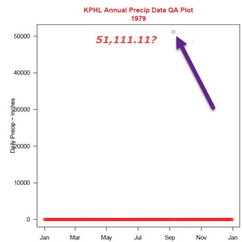
This plot shows the 1979 data, color coded, to reflect that it is a questionable year.

1979_qa_plot


The 51,111 inch daily rainfall value clearly sticks out.

I used the getWeatherData function to retrieve the Sept. 8, 1979 precipitation data to make sure that it was a source data issue and not a processing issue.

 
getWeatherForDate("KPHL", "1979-09-08", opt_custom_columns=T, custom_col=20)

# [1] "Date" "PrecipitationIn" 
# Date PrecipitationIn 
# 1 1979-09-08 51111.11 

This confirms that the source data file data is questionable.

While these data errors may be typographical, they must be corrected prior to proceeding with any analysis of KPHL precipitation data.


Posted in R | Tagged , | Leave a comment

Tracking Precipitation by Day-of-Year

Plotting cumulative day-of-year precipitation can helpful in assessing how the current year’s rainfall compares with long term averages. This plot shows the cumulative rainfall by day-of-year for Philadelphia International Airports rain gauge.

PHL_07_24_16

The source data was downloaded from the Pa Climatologist website for the period 1949:2016. The period 1970 – 2016 was used for the analysis because the data archive does not include January data for 1950 – 1969.

The blue line represents the average day-of-year cumulative rainfall while the minimum and maximum years are shown in grey. The current year, 2016, is shown in red. As of July 24, there was a 5.18 inch negative anomaly in rainfall at the station.

This chart was created in R using base graphics commands.


Posted in R, Uncategorized | Leave a comment

RClimate

This blog focuses on how to use R to study climate data. I will be using readily available public  climate data and R to understand global warming and climate trends. These charts show the types of that I will be making.


Posted in Uncategorized | Leave a comment